Chaarvi Designs was built on a simple idea: good design should not be locked into one category.
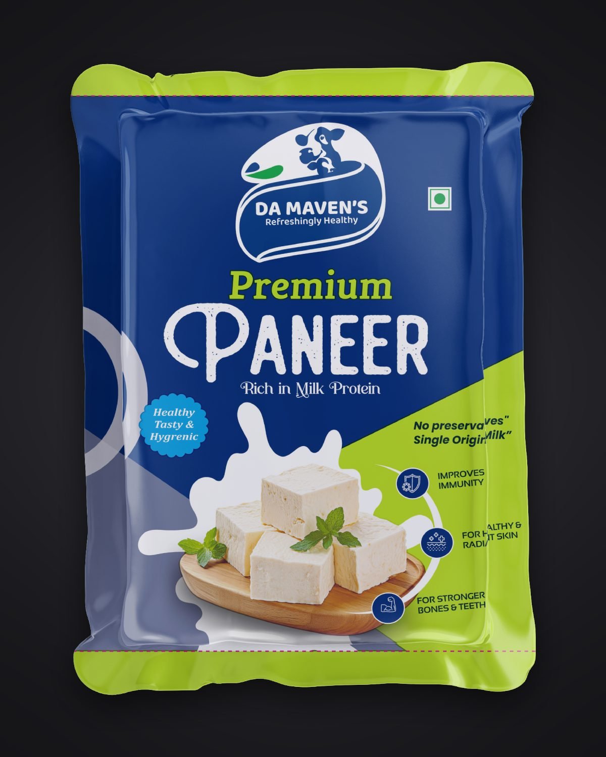
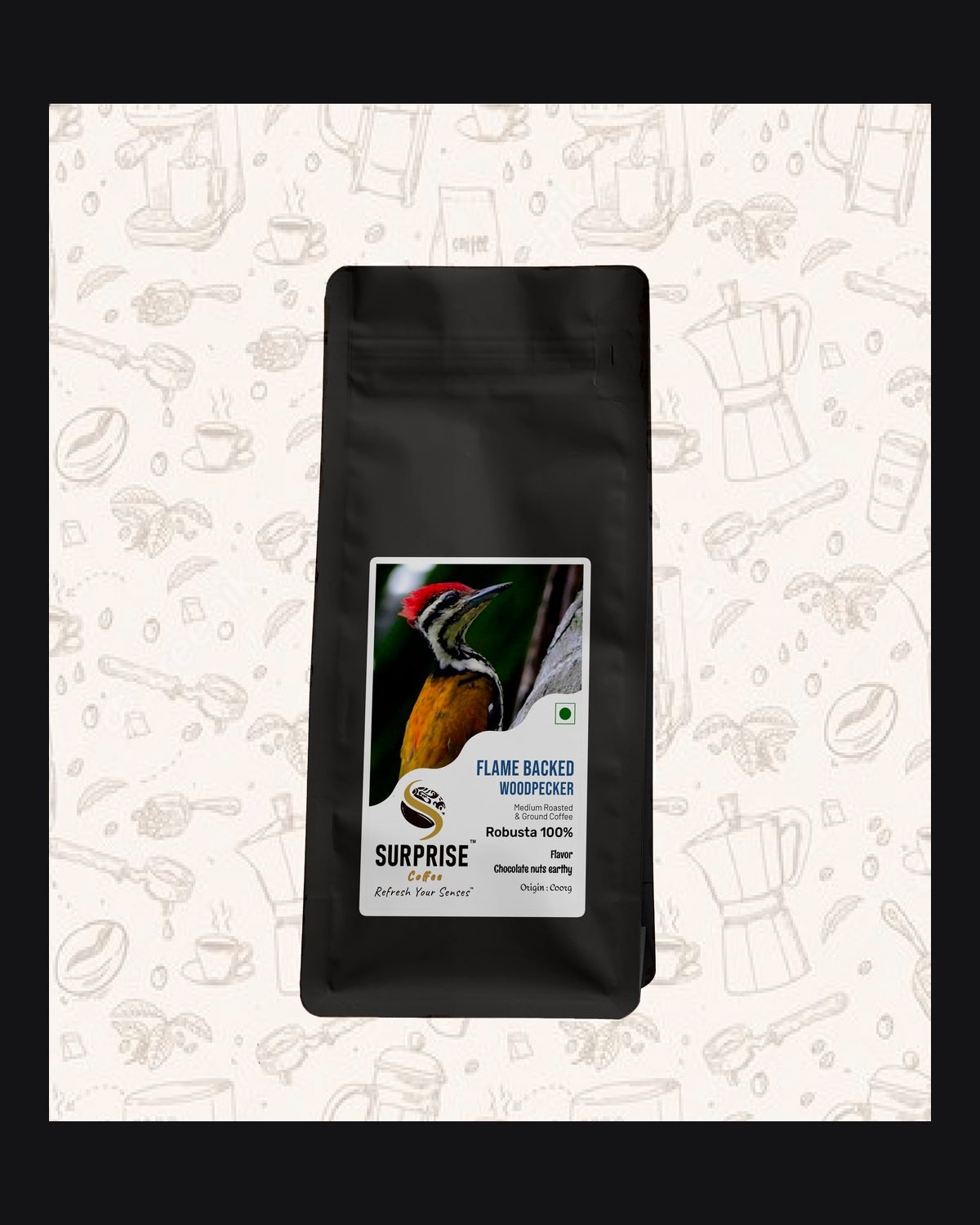
Over 8 years that idea has grown into five connected service lines: Portfolio Management, Packaging Designing, Digital Marketing, Vehicle Branding and Graphic Designing. We have maintained digital portfolios for government bodies and public figures, guided FMCG, dairy and spice brands through packaging artwork and cylinder-ready separations, and helped local businesses across Bangalore, Mysuru and Karnataka build their presence from the ground up.
The process stays the same every time: understand the category, respect its conventions, then design something that stands out inside it.
1+
YEARS OF EXPERIENCE
1
SERVICE CATEGORIES
Our Identity
Our Logo,
Explained
The Monogram
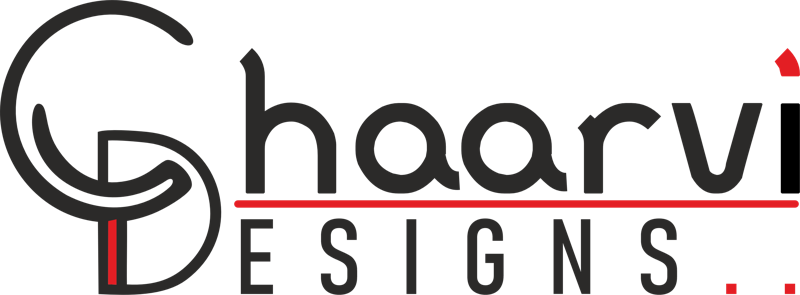
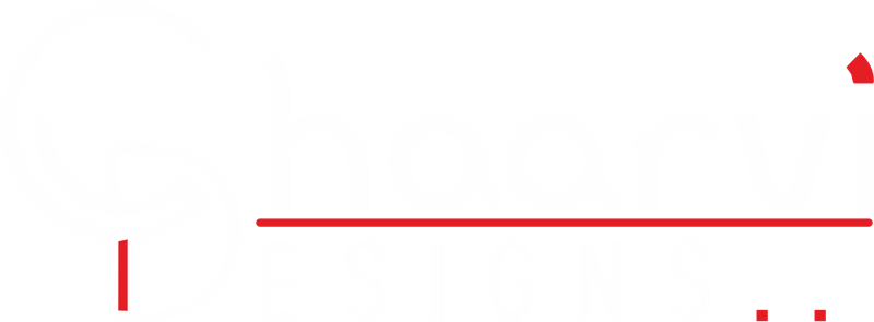
A rounded C curves back into itself and interlocks with a D. It is shorthand for Chaarvi Designs, and it reads as one continuous, unbroken line: everything we do, however different the category, is part of one connected practice.
The Wordmark
A bold, geometric sans-serif in charcoal black, chosen for stability and versatility. A studio working across five categories needs a typeface that feels as much at home next to a government portfolio as it does on a spice-pack mockup.
The Red Accents
The underline beneath the name, the folded mark above the i and the full stops after Designs are used sparingly, the way a designer's red pen marks up a layout: a signal of attention to detail, not decoration.