
How Good Packaging Design Helps Local Food Brands Win the Shelf
For a local food or FMCG brand, the pack is often the first salesperson the customer meets. In a busy kirana store or supermarket aisle, a shopper gives each product a second or two before moving on. In that moment, the packaging has to say what the product is, why it is worth picking up, and why the brand can be trusted.
Over the years we have designed packaging for spice ranges, dairy products, coffee, jaggery and snacks for brands across Karnataka. These are the lessons that come up again and again.
1. Be clear before you are clever
The most common problem we see is a pack that looks attractive but does not say clearly what is inside. Before thinking about patterns or illustrations, make sure three things can be read from a distance: the brand name, the product name and the variant or pack size. Everything else supports these three.
2. Build a family, not a single pack
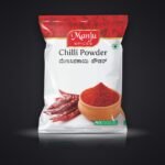
Most brands grow from one product to a range. If each new pack is designed separately, the shelf ends up looking like five different companies. A good packaging system fixes the layout, the logo position and the typography, and then uses colour and imagery to separate variants. When we designed the Manju Spices range, each masala got its own colour and food photograph, but the layout stayed the same, so the whole range reads as one brand from across the aisle.
3. Use colour to help people shop
Colour is the quickest signal a shopper reads. Dairy brands, for example, often use colour to separate toned milk, full cream milk, curd and buttermilk. Once customers learn the code, they reach for the right pouch without reading a word. Pick colours that are distinct from each other and from your nearest competitors.
4. Show the product honestly
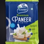
Appetising, realistic product imagery builds trust, especially for food. Avoid images that promise something the product cannot deliver. A clear photograph of the actual spice, paneer or coffee beans usually outperforms an abstract illustration.
5. Design for the printer, not just the screen
A pack that looks perfect on a laptop can fail on the printing machine. Flexible pouches are often printed using rotogravure cylinders, where each colour is engraved separately. Artwork needs correct colour separations, bleed, and text sizes that survive the printing process. Designers with production experience catch these problems before they become expensive reprints.
6. Leave room for the rules
Food packaging in India must carry mandatory information such as the FSSAI licence number, ingredients, nutritional information, net quantity, MRP and manufacturer details. Plan space for these from the start, so they do not end up squeezed into an unreadable corner at the last minute.
The takeaway
Good packaging is not decoration. It is a sales tool that works for you in every store, every day. If you are launching a new product or refreshing an existing range, it pays to get the system right once and build on it.
Planning a new pack or range? See our packaging design service, browse our packaging portfolio, or talk to us.